Bitcoin Specific Metrics:
There is a cottage industry that has built up for providing new statistics and charts for looking at in granular detail, valuing and predicting prices and changes with Bitcoin. These include:
(Source for details below: https://www.lookintobitcoin.com/charts/)
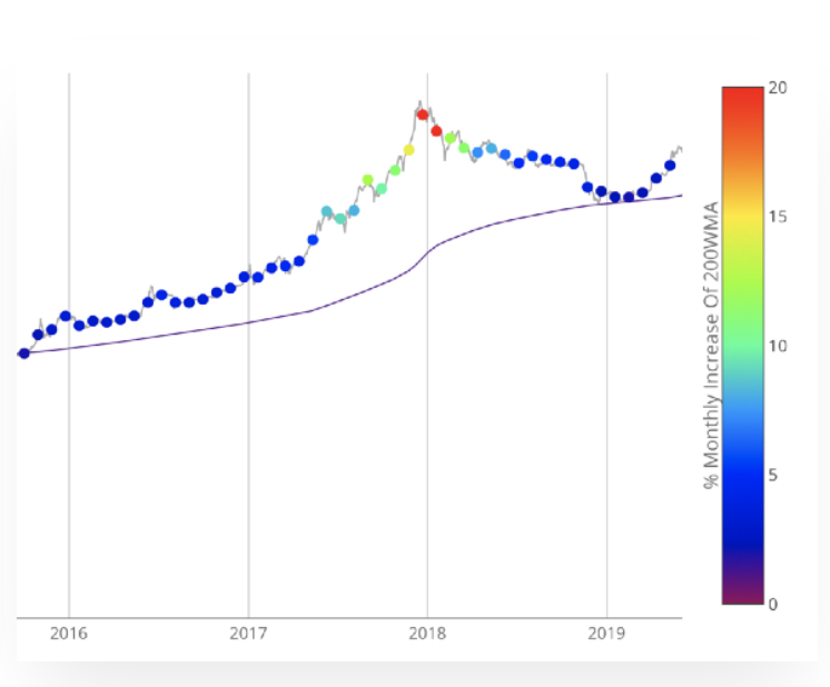
200 Week Moving Average Heatmap
In each of its major market cycles, Bitcoin's price historically bottoms out around the 200 week moving average. This indicator uses a colour heatmap based on the % increases of that 200 week moving average. Depending on the month-by-month % increase of the 200 week moving average, a colour is assigned to the price chart. Long term Bitcoin investors can monitor the monthly colour changes. Historically, when we see orange and red dots assigned to the price chart, this has been a good time to sell Bitcoin as the market overheats. Periods where the price dots are purple and close to the 200 week MA have historically been good times to buy. The 200WMA heatmap can be a useful tool as it shows on a historical basis whether the current price is overextending (red dots) and may need to cool down. It can also show when Bitcoin price may be good value on a historical basis. This can be when the dots on the chart are purple or blue. Over more than ten years, $BTC has spent very little time below the 200 week moving average (200WMA) which is also worth noting when thinking about price predictions for Bitcoin or a Bitcoin price forecast.
Created by and further reading: Plan B
https://twitter.com/100trillionUSD
The Puell Multiple
This metric looks at the supply side of Bitcoin's economy - bitcoin miners and their revenue. It explores market cycles from a mining revenue perspective. Bitcoin miners are sometimes referred to as compulsory sellers due to their need to cover fixed costs of mining hardware in a market where price is extremely volatile. The revenue they generate can therefore influence price over time. The Puell Multiple is calculated by dividing the daily issuance value of bitcoins (in USD) by the 365-day moving average of daily issuance value.
There are periods of time where the value of bitcoins being mined and entering the ecosystem is too great or too little relative to historical norms. Understanding these periods of time can be beneficial to the strategic Bitcoin investor. The chart above highlights periods where the value of Bitcoin's issued on a daily basis has historically been extremely low (Puell Multiple entering green box), which produced outsized returns for Bitcoin investors who bought Bitcoin here. It also shows periods where the daily issuance value was extremely high (Puell Multiple entering the red box), providing advantageous profit-taking for Bitcoin investors who sold here.
The Puell Multiple uses the upper red band on the chart to show when miner revenues in USD terms are significantly higher than historical norms (in this case the 365-day moving average). Over the majority of Bitcoins’ existence, these periods have been when the price of $BTC has also reached its major highs. So the Puell Multiple can be a useful Bitcoin forecasting tool to identify based on this metric whether price is too high and needs to drop (when the indicator is in the red zone), or whether it is too low and may need to bounce (indicator is in the green zone).
Created by and further reading: David Puell
https://twitter.com/dpuellARK

Stock-to-Flow Model
This model treats Bitcoin as being comparable to commodities such as gold, silver or platinum. These are known as 'store of value' commodities because they retain value over long time frames due to their relative scarcity. It is difficult to significantly increase their supply i.e. the process of searching for gold and then mining it is expensive and takes time. Bitcoin is similar because it is also scarce. In fact, it is the first-ever scarce digital object to exist. There are a limited number of coins in existence and it will take a lot of electricity and computing effort to mine the 3 million outstanding coins still to be mined, therefore the supply rate is consistently low.
Stock-to-flow ratios are used to evaluate the current stock of a commodity (total amount currently available) against the flow of new production (amount mined that specific year). For store of value (SoV) commodities like gold, platinum, or silver, a high ratio indicates that they are mostly not consumed in industrial applications. Instead, the majority is stored as a monetary hedge, thus driving up the stock-to-flow ratio. A higher ratio indicates that the commodity is increasingly scarce - and therefore more valuable as a store of value.
On the Stock-to-Flow Model chart price is overlaid on top of the stock-to-flow ratio line. Price continues to follow the stock-to-flow of Bitcoin over time. The theory, therefore, suggests that we can project where price may go by observing the projected stock-to-flow line, which can be calculated as we know the approximate mining schedule of future Bitcoin mining.
The coloured dots on the price line of this chart show the number of days until the next Bitcoin halving (sometimes called 'halvening') event. This is the event where the reward for mining new blocks is halved, meaning miners receive 50% fewer bitcoins for verifying transactions. Bitcoin halvings are scheduled to occur every 210,000 blocks – roughly every four years – until the maximum supply of 21 million bitcoins has been generated by the network. That makes stock-to-flow ratio (scarcity) higher so in theory price should go up. This has held true previously in Bitcoin's history.
Created by and further reading: Plan B
https://twitter.com/100trillionUSD
Bitcoin Logarithmic Growth Curves
Logarithmic analysis uses historical data to forecast and predict future prices. The Bitcoin Logarithmic growth curve takes all the historical price data of Bitcoin and uses log growth analysis to develop curves that project a potential path of future price growth.
Historically, price tends to bounce between the upper and lower bounds of the logarithmic growth curve. The reason for this is because Bitcoin moves through market cycles.
Further reading: Harold Christopher Burger, Cole Garner and Quantadelic
https://twitter.com/hcburger1
https://twitter.com/ColeGarnerBTC/media
https://twitter.com/quantadelic/media


